
Sunday 29 December 2013
Thursday 26 December 2013
Contents Page Photo Editing 2


Wednesday 25 December 2013
Contents Page Photo Editing 1


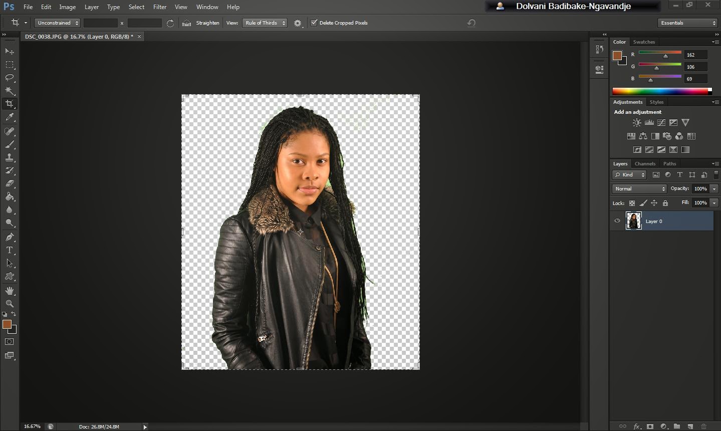

From this i deleted the green background using the magic wand so that i can put my own background in. From then i took away all the green from the hair and then i cropped the image and changed the background to grey using a paint bucket.
Sunday 22 December 2013


Saturday 21 December 2013
Friday 20 December 2013

Sunday 17 November 2013
Front Cover Editing

Here i am editing the picture and giving it an effect.

I edited the picture to give it a black and white effect and fixed up the colour balance to make it lighter.

I used the colour meter to edit the brightness of the background and the colour on my face.
Saturday 16 November 2013
Chosen Front Cover Photo

Friday 15 November 2013
Wednesday 13 November 2013
Photo Shoot Preparation

This is a brainstorm which tells us what we will be using in the photo shoot for my magazine
Tuesday 12 November 2013
Plan For Artist

Peer Assessment


Sunday 10 November 2013
Music Magazine Draft


This is the contents page to my music magazine. Please give feedback on how i could improve my front cover and contents page.
Friday 8 November 2013
Moodboard/Double Page Spreads

This is a mood board for music magazine double page spreads.

The
artist in the article is Tinie Tempah. Tinie is a rapper and this would be
aimed for young people aged 10 to 25 because there are a lot of people that
really like rap music some of those people are teenagers and others are adults.
The
language used in the article is informal. Words like “FOR FUCK SAKE!” and “man”
is informal language and is placed in the article to suit the target audience
Bright
colours are used to show it’s a happy and really cheerful article. The colour
of the title is in black so the reader isn’t drawn away from the actual
article.
For
the title of the article, a big bold font style is being used to present the
article and because it’s a really big font size it’s noticeable. But the rest
of the text is in a smaller and skinnier font style and size making it look
like it’s not really important.
On
the double page article it has one big picture on the first page on the top
half of the page and below it the title. Below the title you then have two
paragraphs which run along the bottom of the page. Next to the two paragraphs
you have three picture of Tinie Tempah in the studio recording and that takes
up the bottom half of the second page. At the top of the second page you have a
medium sized picture of Tinie Tempah in the studio. Below that you have two columns
of text which have been separated by a must know rectangular box which goes
down the middle separating the two columns of text.
Most
of the pages have been taken up by images and a small percentage of the page
has been taken up by text. 70% of the page is taken up by images and the
remaining 30% is taken up by text.
The
tone used in the magazine when addressing the reader is an informed intelligent
fan because it’s not making the reader feel involved in the article.
The
artist is presented as a cool, easy going and hard-working guy. He’s shown to
be having fun at times and enjoying himself while he’s working.
The style of the article is shown to be well
organised. The font of the article is big and bold and black and the colour red
is used frequently. In the front cover everything is laid out the same. The
colour red is used to symbolise the logo of the magazine and the bold title
shows the more important articles.
The
article doesn’t demand any prior knowledge but you would have to know who the
artist is to fully understand what is going on in the article.
Wednesday 6 November 2013
Tuesday 5 November 2013
Mood Board/Front Cover Ideas

In the magazine covers you can see that most of the camera shots are mid-shots and have slight low angles. These shots are mostly used for front covers with men as the central image. These are more masculine shots and shows power and aggression. Their costumes are mainly suits and this shows that they mean business; making them look rich and boss-like. The men in the magazine covers were made to look like rich and intimidating businessmen. The other camera shots in this image board are close ups and normal mid-shots which are used on the women. The women in the magazine covers are made to look like sophisticated women. The close-ups show more detail in their expression and the mid-shots show their face and what they're wearing which by the looks of it show that the women look sophisticated and empowered because their clothing is so good looking and expensive and the facial expression look quite happy. The magazine covers have made the women look like divas.
In the magazine cover the title blocks are quite bold, big and simple which is seen in the Vibe magazine. Its also the same for the Billboard magazine which has a really simple font style. The font size is also really big and bold.
The colours on the cover are really bright and clear and also quite vibrant.
The types of articles in these magazines would be interviews on Hip-Hop or RnB artists.Could be introducing new artists to audiences and also biographies about the artist.
Thursday 31 October 2013
Title Block Decision
After my poll i have decided to go for a different title block. This title block has the font that you see on jersey jackets and it is quite urban. This reflects both my audience and the music associated with my magazine because the music is urban which is the latest music and my target audience likes urban music so it relates.

Tuesday 22 October 2013
Title Block Ideas
Logo 1


Logo 2

Logo 3

These 3 logos are options for my Hip-Hop music magazine title logo. Please vote for the cover that looks more appealing you.
Tuesday 15 October 2013
Title Block Analysis

The colours in the title font tell us that this is an urban
magazine. Tells us it’s really nice and bright and rich. They have used this
colour because it’s a bright, attractive and it’s a really nice shade of red so
people would be convinced to buy it.
The font style tells us it’s a really stylish magazine. The style
is shown to be really posh and that tells us that the magazine is really rich
and is also a modern day magazine. The style and colour of the title block is
big and red with a white outline around it. The colour red connotes bright,
sexy, outstanding and eye catchy. The style connotes boldness, new, richness
and unique. This tells us that there’s no other magazine like Rolling Stone.
This magazine has all the latest information on artists and the latest trends
of style. It’s sexy; it’s unique and also rich.
The title Rolling Stone is also the name of a band called The
Rolling Stones which is a rock & roll band from 1962 which has been
together for over 50 years. This tells me that this magazine is a really
popular magazine that everyone has heard about and has been around for a long
time and everybody loves it. The title could mean that they have been rock and
rolling since 1962.
The target audience could be men who enjoy listening to old rock
and roll music because the title is related to the rock band and more people
know the name Rolling Stone as a rock and roll band. However because nobody
really listens to old rock and roll music Rolling Stones would associate
themselves with popular music like Rap and Pop music. To conclude I would say
the target audience is going to be people aged 16 to people in their 30s.

The NME magazine genre is new music. The new music genres they
associate themselves with are rock music and sometimes rap music. The rock
artists they focus on are artists like Green Day, Arctic Monkeys and Linkin
Park. The artists from the Rap genre
that they associate with are Eminem and Jay-Z.
The colours in the title block are red, white and black. This
tells us that it’s new and bold. This has been used to attract their target
audience and to make it stand out.
The font of the title is really bold and big which tells us
everything in the magazine is really big news. It’s big, it’s simple and really
bold which could mean that the magazine is the type of magazine that stands out
and has a lot of big news in it.
The title itself tells us that the magazine has to do with new
music. It’s got all the latest information on the latest music because the
title “NME” stands for New Musical Express. The word express sounds like
transport so it could mean that NME transports you from old to new music.
The target audience would be young adults aged 14 to 18 because there
are younger people that listen to the latest music such as Rap and Rock music.

Q Magazine is associated with all types of music such as Rap, Pop,
Rock music and more. The rock artists they’re associated with are Kings of Leon
and Coldplay. Rap artists they’re associated with are Jay-Z and Eminem. Pop
artists they’re associated with are Adele.
The colours of the title are red and white. The red in the title
block looks a little bright so it makes it look old. This tells me that it’s
quite old. They done this to make the title stand out and this could tell us
the audience that the artists stand out as well.
The font is really simple but it’s really big and bold so it tells
me that the magazine is a major magazine and it’s really popular magazine. The
font connotes simplicity and boldness.
The letter Q sounds like the word queue like you’re queuing for
something. Like there’s tracks queued on the list. Telling us there’s more
music to come.
The target audience could be young people aged 16 to around their
20s because Q are associated with a range of different genres and new music so
it would attract them more.
Friday 11 October 2013
Tuesday 1 October 2013
Initial Planning For New Magazine

This is a brainstorm of ideas for my music magazine. I have considered the different genres that people are into nowadays, how often the magazine should be released, the target audience, how the magazine should look and if the readers would be interested in reading about their favorite artists and upcoming albums.
Monday 30 September 2013
Evolution Of Britney
Image
1

The
image was made to show Britney’s body from the waist and above but it is taken from above so it is a high angle picture and they
cropped out her legs to show her body from her waist and above. This magazine
would be typical for boys or "lads" from ages 11 to 18 because there would be a lot of boys that would buy magazines with
a sexy half naked girl for a front cover.
Britney
Spears’s costume is a shirt that has been unbuttoned, boxer shorts and a black
bra. This is more appealing to teenage boys because she is barely wearing any
clothes and she seems quite sexual and lustrous.
The
props used are a telephone and a telletubbies doll. This shows that she is quite young and immature
because she still owns a doll. The telephone in her hand tells us that she is
on the phone to a boy because her facial expression looks really sexual and
mischievous.
The
setting is a bedroom. You can see she is
lying on a silk pink bed cover which gives out a type of girly, immature and
young essence.
The color used is a glossy pink because it is
quite bright and attractive which would relate more to teenage girls and would
make them want to buy the magazine.
Image
2

The
second image of Britney Spears is another mid-shot picture taken from the waist
above to show her body.
Britney
is not wearing anything apart from white
knickers and her pose is her on the wall sticking her bum outwards. The pose
and costume is really sexual and also tells us she wants a sexual relationship
with the reader.
The
setting is a house which connotes safety, freedom and comfort.
The
type of lighting used is high-key lighting.
Bright colors are being used to make her look nicer.
Image
3

The
image has been chosen to show Britney’s emotion since it is a close-up shot. The image shows that she's quite
upset. Her face looks really lifeless and empty and this could mean that she
has been through a traumatic event. The color black and white is significant because it also projects this sense of lifeless and emotionless feeling which is seen in Britney's facial expression.
It has been cropped so it only shows her
face
The
image shows that Britney wants a more intimate and meaningful relationship.
This is supported by the text because the text tells us what Britney is going
through and you can see that she’s going through something emotional since the
image is not a really happy and bright one.
Friday 27 September 2013
Focus Group
Friday 20 September 2013
Survey Analysis Pt.3

This question asks how often i should release my magazine. More people said once a month than once a week and a fortnight. From this i know that people prefer magazines that come out once a month which has brand new information and so on.

The last question asks how much
people would spend on magazines depending on how often they read them. More people responded £1.50 - £2.00. I now know that people do not like to spend a lot on magazines.
Survey Analysis Pt.2

This is the fifth question of the
questionnaire asking if the reader would be interested in reading about
interview and getting to know their favorite answer. A lot of people would want to know about their favorite artists so i will have to add articles on their artists


This question asks if readers would like to receive information about any new musical equipment. Again there are more no’s than yes’s for this question. This would also be an unpopular topic so i will not put it in the magazine.

This question asks if the reader is a
musician. There are more people who are not musicians than people who are. This would be another unpopular topic in the magazine so i will not add this.
Survey Analysis Pt.1


The second screenshot is to do with
what people would like to see in a music magazine. There are three options in
the question. The first one is for a magazine to have more pictures than text.
The second option is more text than pictures and the third option is both. More people chose a lot of pictures and the both option. Fewer amounts of people
chose less pictures and more text. Now i know that the magazine will need to have more images.


This question asks whether you would
like to see information about any local unsigned artists.
More people responded yes than people that responded no so there will have to be information about unsigned artists in the local area.

This question asks whether you would like to see information on competitions, concert and upcoming albums in the magazine. Again there are more yes’s than no’s so the magazine will include information on competitions, concerts and upcoming albums.

This question asks whether you would like to see information on competitions, concert and upcoming albums in the magazine. Again there are more yes’s than no’s so the magazine will include information on competitions, concerts and upcoming albums.
Thursday 19 September 2013
Institutional Research
Institutional
Research
Bauer

Bauer
owns a lot of mainstream magazines like Q and Kerrang. They also own magazines
which are quite niche which would only attract people that like and associate
themselves with the category. For example, Golf weekly and garden news are
niche magazines.
Bauer
owns magazines from different categories. They own a few women’s mainstream
magazines. Magazines like Grazia and Closer are mainstream women’s magazines.
It also has men’s niche magazines and mainstream magazines like Golf Weekly and
FHM.
The
brand image is a 3-D cube with colours red, orange, green, blue and white on
the lines of the cube. The cube is inside a blue square and on the inside of
the cube is a triangle on the top right hand side and Bauer written inside.
Bauer
owns all the magazines listed on the website and other media products like
radio stations, music channels and online websites. Bauer owns the 4Music
channel, Kiss, Q radio station, Smashhits radio station and many more.

IPC Media
IPC
Media owns a mainstream magazine and niche magazines but no other media
products. They own niche magazines like Cycling Weekly
and Beautiful Kitchen. They also own mainstream magazines like NME.
They
also own magazines for both men and women. A men’s magazine would be Golf
Monthly and Motor Boat. These are men’s niche magazines. For women there are
niche magazines like Beautiful Kitchens and Good to Know Recipes. The
mainstream magazine that both men and women would both read is NME.
The
brand image is simple. It says IPC Media with a straight line separating the
word media from IPC. The IPC is written in a more stylish font and the word
media is written in a simple font.
IPC
Media owns a lot of niche magazines and only one mainstream magazine. Some of
the magazines they own are Cycling Weekly, Beautiful Kitchens and NME.
 Immediate Media
Immediate
Media is a media company which owns a range of different TV programmes a TV channel
and magazines. Most of their programmes are niche. The programmes are set for a
certain age group and for people who like certain topics. Examples of their
niche programmes are Gardeners’ World, Olive and Charlie and Lola. A mainstream
magazine that Immediate Media owns is RadioTimes.
Like
every other media company they own programmes for men and women. Programmes
like KnitToday and Made for Mums are mainly for women. However programmes like
Top Gear and Match of the Day are men’s programmes. A magazine in which both
genders would read is RadioTimes because it doesn’t target a specific gender.
The
brand image is big, bold, blue writing which says Immediate Media with CO
written next to media in a smaller font and the word media is written below the
word immediate.
Immediate
Media owns other media products which are TV programmes and a TV channel.
 Development Hell
Development
Hell is an independent media company that owns two magazines which are both
mainstream. The magazines they own are Mixmag and Don’t Stay In.
Their
target audience are people who are interested in dance and club music and also
for people who go clubbing. Also for musicians who are looking for venues and
musical equipment. This would attract people of ages 16 to 25.
The
brand image is quite simple. Its red writing that says Development Hell with
Limited written underneath the word Development.
Development
Hell own other media products such as Mixmag TV, Mixmag.net the online website,
Mixmag iPad app, Mixmag Events and the world’s biggest clubbing social network
called Don’t Stay In.
Subscribe to:
Posts (Atom)