Music Magazine Evaluation Presentation
Have a look at my evaluation presentation. Here I will be explaining the process of making my music magazine.
AS Media Foundation Portfolio
Friday, 28 February 2014
Friday, 24 January 2014
Final Music Magazine
This is my music magazine which i have edited. In this one i have taken out the magazine's information like the twitter and put it on the contents page and added an instagram page. Also added the magazine details such as the email address and their number. I changed up the colours and made the anchorage text bigger. Organised the texts better and added some buzz words like "FREE" and "PLUS."
The contents page has been put together to make a double page contents page. This way there is more room for the regular section and there is also room for some images. There is now more room for the features so it is not hiding in the artist; so the colours do not make the text blend in.
The double page article has text going around my artist so it looks good. There is now a pull quote. The images look better and i have gotten rid of the green background.
Wednesday, 1 January 2014
How I Can Improve My Magazine
Ways I could
improve my music magazine cover are that I could change up how I have organised
my puffs on the front cover. Everything looks really cluttered and there are
puffs overlapping the central image which is not good. I also need to remove
all the social network information and contact information off of the front
cover. It does not look attractive and it belongs on the contents page. I need
to make my title block bigger, the barcode smaller and also fix the font colour
of the words in the puffs and in the skyline. The font colours on different
words could confuse the audience so it would be best if everything was of a
single colour. It will look a lot better.
The contents
page needs to become a double page contents page. This way I can add in more picture
and the audience can see more of what is coming up in the magazine and also it
will look more appealing to the target audience because they would like to see
more pictures in the magazine. There should be a section where people can see
the contact information of the company and social network links. This needs to
be included in the contents page. I could also link the colour scheme from the
front cover to the contents page to create a house style.
For my
double page article I would have to change the background of the article
introduction page. The green background does not look good so I will have to
replace it with a different colour background so that it looks better. The text
in the double page article needs to be rearranged so that it is in columns. I
could also put images beside the text so that it looks nice and more images of
the artist needs to be included in the double page article.
Sunday, 29 December 2013
Thursday, 26 December 2013
Contents Page Photo Editing 2
In this editing i took away the background with the magic wand again and put in a plain white background. I then changed the colour of the person and made it black and white and edited the black and white effect.
Wednesday, 25 December 2013
Contents Page Photo Editing 1
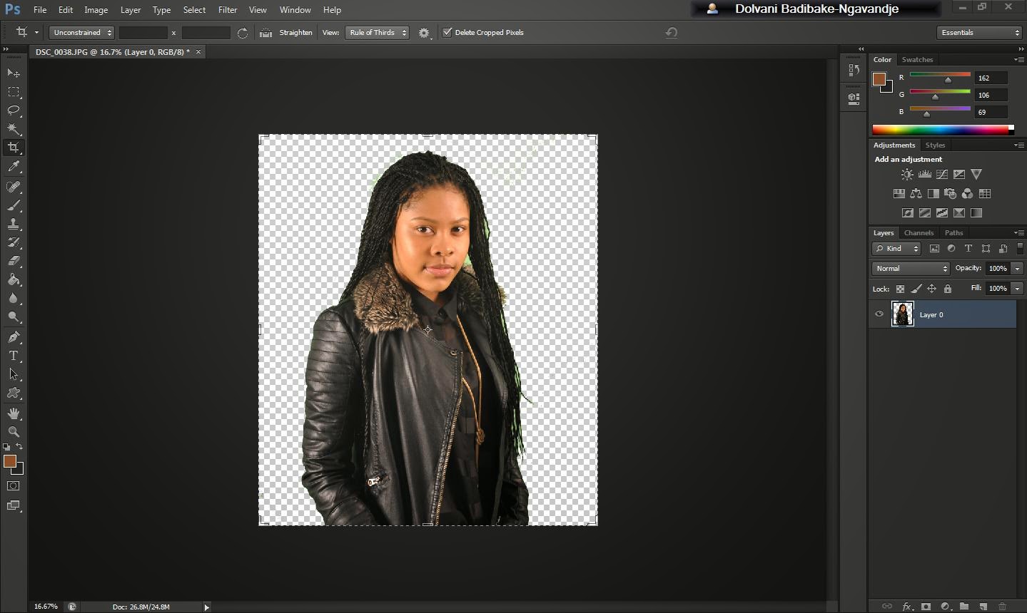
From this i deleted the green background using the magic wand so that i can put my own background in. From then i took away all the green from the hair and then i cropped the image and changed the background to grey using a paint bucket.
Sunday, 22 December 2013
Subscribe to:
Comments (Atom)


